Me too Vic. The quieter colors of the cottage sit better in the country side and suggest the old age of the structure, but the second one has appeal too; it has life. The the colors are more lively and the blue shadows on the road specked with burnt orange widen my sense of the setting. I think the roof needs to be grayed down a tad, a glaze perhaps? You know best. Someone lives in the second cottage. I'm not so sure about the first. Charming painting both though. Brighten up one; dull down the second and you've got two winners.
Hi Linda. Thank you for your wonderful comment. I do agree with you of what you suggested for both cottages. I will not be doing anything to either of them except shove them both into the regect box. Spot on with your comment Linda, thank you. All the best. Vic.
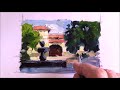
My first reaction was that Cottage 1 was best, but then I began to find the colours in the second one more interesting. I think it could be improved by making the gable-ends cooler, perhaps with a blue glaze.
Morning Keith. thank you for your comment. You could be right about the Gable end. But I won`t be doing anything else to no`2. The first one is sold and the second one is amongst the not like one`s. Thank you keith and all the best. Vic.
Love both of them, my favorite is #1, they are both great paintings Vic. It just shows your wonderful ability using various palettes. Well done my friend.
Hi Joan. Glad you like them both. but I personally prefer no`1 as most including you do. painted the first one some time ago but the second one just the other day. I have just noticed that you have posted a new one so I shale be checking that out later after I get back from taking Rosemary to her line Dancing club. All the best my friend. Vic.
Good Morning Vic!... Both paintings are equally successful... and have enough merit to stand on their own alone. Each captures that intimate cottage feel!
Number one has a fluidity created by your tonal control and a more developed backdrop to support the central image and foreground.
The second has stronger play on light and shadow and a very active and interesting sky features. I like both for very different reasons.
I must say that the paintings that you produce that capture the greatest feeling of your soul... are your "boatscapes". They are all magnificent and speak to me of your very deep love of sailing and the sea!
Paint what you feel and have a passion for... and it will always turn out a winner!
Enjoyed my visit!
Good painting!... Happy Spring! Warmest regards, Bruce
Good Morning to you Bruce.. Thank you very much for your most welcome comment. It is a brilliant pat on the back for me, thank you. I must visit your blog as offen as I can. I love your free and easy style and brilliant colour. God bless you bruce for this lovely comment of my Cottages. All the best. Vic.
Very interesting to see both paintings together. I agree with you Vic, I like the first one because the colors seem too warm in the second version. I think the overall composition is much stronger in the first one as well. Thanks for posting both, you did a nice job!
Hi Kim. Thank you for your nice comment. I agree with you, the colours in the second painting are too warm. Mind you iI did do that on purpose. i wanted to go against the norm, but it didn`t work out. Thank you Kim and all the best. Vic.
Both of your cottage paintings are lovely. I think I prefer the first one too. It's wonderful to see the same subject in two very different palettes. Happy Painting.


Me too Vic. The quieter colors of the cottage sit better in the country side and suggest the old age of the structure, but the second one has appeal too; it has life. The the colors are more lively and the blue shadows on the road specked with burnt orange widen my sense of the setting. I think the roof needs to be grayed down a tad, a glaze perhaps? You know best. Someone lives in the second cottage. I'm not so sure about the first. Charming painting both though. Brighten up one; dull down the second and you've got two winners.
ReplyDeleteHi Linda.
ReplyDeleteThank you for your wonderful comment. I do agree with you of what you suggested for both cottages. I will not be doing anything to either of them except shove them both into the regect box. Spot on with your comment Linda, thank you. All the best.
Vic.
Hi Vic,
ReplyDeleteboth painterly, I agree the #1 is the best.
Hi Mariano.
ReplyDeletethanks for your comment. the more I look at cottage 2, the more I don`t like it. All the best Mariano.
Vic.
I love them both, but the first one is truly beautiful. I always seem to like the subtle colors best!!
ReplyDeleteHi Hilda.
ReplyDeleteThank you for your comment. It looks like no` 1 wins then doesn`t it? All the best Hilda.
Vic.
My first reaction was that Cottage 1 was best, but then I began to find the colours in the second one more interesting. I think it could be improved by making the gable-ends cooler, perhaps with a blue glaze.
ReplyDeleteMorning Keith.
ReplyDeletethank you for your comment. You could be right about the Gable end. But I won`t be doing anything else to no`2. The first one is sold and the second one is amongst the not like one`s. Thank you keith and all the best.
Vic.
Hi Vic,
ReplyDeleteLove both of them, my favorite is #1, they are both great paintings Vic. It just shows your wonderful ability using various palettes. Well done my friend.
All the best to you,
Joan
Hi Joan.
ReplyDeleteGlad you like them both. but I personally prefer no`1
as most including you do. painted the first one some time ago but the second one just the other day. I have just noticed that you have posted a new one so I shale be checking that out later after I get back from taking Rosemary to her line Dancing club. All the best my friend.
Vic.
Good Morning Vic!... Both paintings are equally successful... and have enough merit to stand on their own alone. Each captures that intimate cottage feel!
ReplyDeleteNumber one has a fluidity created by your tonal control and a more developed backdrop to support the central image and foreground.
The second has stronger play on light and shadow and a very active and interesting sky features. I like both for very different reasons.
I must say that the paintings that you produce that capture the greatest feeling of your soul... are your "boatscapes". They are all magnificent and speak to me of your very deep love of sailing and the sea!
Paint what you feel and have a passion for... and it will always turn out a winner!
Enjoyed my visit!
Good painting!... Happy Spring!
Warmest regards,
Bruce
Good Morning to you Bruce..
ReplyDeleteThank you very much for your most welcome comment. It is a brilliant pat on the back for me, thank you. I must visit your blog as offen as I can. I love your free and easy style and brilliant colour. God bless you bruce for this lovely comment of my Cottages. All the best.
Vic.
Very interesting to see both paintings together. I agree with you Vic, I like the first one because the colors seem too warm in the second version. I think the overall composition is much stronger in the first one as well. Thanks for posting both, you did a nice job!
ReplyDeleteHi Kim.
ReplyDeleteThank you for your nice comment. I agree with you, the colours in the second painting are too warm. Mind you iI did do that on purpose. i wanted to go against
the norm, but it didn`t work out. Thank you Kim and all the best.
Vic.
Both of your cottage paintings are lovely. I think I prefer the first one too. It's wonderful to see the same subject in two very different palettes.
ReplyDeleteHappy Painting.
Hi Nora.
ReplyDeleteI also prefer the first Cottage. I have found that most Artist`s do. Thank you Nora. All the best.
Vic.